AppBar

Basic AppBar
Inherits: AdaptiveControl
Properties
-
actions(list[Control] | None) –A list of
Controls to display in a row after the title control. -
actions_padding(PaddingValue | None) –The padding between the
actionsand the end of this app bar. -
automatically_imply_leading(bool) –Whether we should try to imply the
leadingcontrol if it isNone. -
bgcolor(ColorValue | None) –The fill color to use for this app bar.
-
center_title(bool | None) –Whether the
titleshould be centered. -
clip_behavior(ClipBehavior | None) –The content will be clipped (or not) according to this option.
-
color(ColorValue | None) –The default color for
Text -
elevation(Number | None) –The app bar's elevation.
-
elevation_on_scroll(Number | None) –The elevation to be used if this app bar has something scrolled underneath it.
-
exclude_header_semantics(bool) –Whether the
titleshould be wrapped with header -
force_material_transparency(bool) –Forces this app bar to be transparent (instead of Material's default type).
-
leading(Control | None) –A control to display before the toolbar's
title. -
leading_width(Number | None) –Defines the width of the
leadingcontrol. -
secondary(bool) –Whether this app bar is not being displayed at the top of the screen.
-
shadow_color(ColorValue | None) –The color of the shadow below this app bar.
-
shape(OutlinedBorder | None) –The shape of this app bar's Material as well as its shadow.
-
title(StrOrControl | None) –The primary Control displayed in this app bar.
-
title_spacing(Number | None) –The spacing around
titleon the horizontal axis. -
title_text_style(TextStyle | None) – -
toolbar_height(Number | None) –Defines the height of the toolbar component of this app bar.
-
toolbar_opacity(Number) –The opacity of the toolbar.
-
toolbar_text_style(TextStyle | None) –The style to be used for the
Textcontrols in the
Examples#
Actions and Popup Menu#
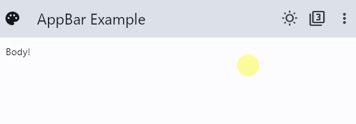
import flet as ft

def main(page: ft.Page):
    page.title = "AppBar Example"

    def handle_checked_item_click(e: ft.Event[ft.PopupMenuItem]):
        e.control.checked = not e.control.checked
        page.update()

    page.appbar = ft.AppBar(
        leading=ft.Icon(ft.Icons.PALETTE),
        leading_width=40,
        title=ft.Text("AppBar Example"),
        center_title=False,
        bgcolor=ft.Colors.BLUE_GREY_400,
        actions=[
            ft.IconButton(ft.Icons.WB_SUNNY_OUTLINED),
            ft.IconButton(ft.Icons.FILTER_3),
            ft.PopupMenuButton(
                items=[
                    ft.PopupMenuItem(content="Item 1"),
                    ft.PopupMenuItem(),  # divider
                    ft.PopupMenuItem(
                        content="Checked item",
                        checked=False,
                        on_click=handle_checked_item_click,
                    ),
                ]
            ),
        ],
    )
    page.add(ft.Text("Body!"))


if __name__ == "__main__":
    ft.run(main)
Theme and Material Mode Toggles#
import flet as ft

LIGHT_SEED_COLOR = ft.Colors.DEEP_ORANGE
DARK_SEED_COLOR = ft.Colors.DEEP_PURPLE


def main(page: ft.Page):
    page.title = "AppBar Example"

    def handle_checked_item_click(e: ft.Event[ft.PopupMenuItem]):
        e.control.checked = not e.control.checked
        page.update()

    page.theme_mode = ft.ThemeMode.LIGHT
    page.theme = ft.Theme(color_scheme_seed=LIGHT_SEED_COLOR, use_material3=False)
    page.dark_theme = ft.Theme(color_scheme_seed=DARK_SEED_COLOR, use_material3=False)
    page.update()

    def toggle_theme_mode(e: ft.Event[ft.IconButton]):
        page.theme_mode = (
            ft.ThemeMode.DARK
            if page.theme_mode == ft.ThemeMode.LIGHT
            else ft.ThemeMode.LIGHT
        )
        theme_mode_toggle.icon = (
            ft.Icons.WB_SUNNY_OUTLINED
            if page.theme_mode == ft.ThemeMode.LIGHT
            else ft.Icons.WB_SUNNY
        )
        page.update()

    theme_mode_toggle = ft.IconButton(
        icon=(
            ft.Icons.WB_SUNNY_OUTLINED
            if page.theme_mode == ft.ThemeMode.LIGHT
            else ft.Icons.WB_SUNNY
        ),
        on_click=toggle_theme_mode,
    )

    def toggle_material(e: ft.Event[ft.IconButton]):
        use_material3 = not page.theme.use_material3
        page.theme = ft.Theme(
            color_scheme_seed=LIGHT_SEED_COLOR, use_material3=use_material3
        )
        page.dark_theme = ft.Theme(
            color_scheme_seed=DARK_SEED_COLOR, use_material3=use_material3
        )
        material_mode_toggle.icon = (
            ft.Icons.FILTER_3 if page.theme.use_material3 else ft.Icons.FILTER_2
        )
        page.update()

    material_mode_toggle = ft.IconButton(
        icon=ft.Icons.FILTER_3 if page.theme.use_material3 else ft.Icons.FILTER_2,
        on_click=toggle_material,
    )

    page.padding = 50
    page.appbar = ft.AppBar(
        # toolbar_height=100,
        bgcolor=ft.Colors.SECONDARY_CONTAINER,
        leading=ft.Icon(ft.Icons.PALETTE),
        leading_width=40,
        title=ft.Text("AppBar Example"),
        center_title=False,
        actions=[
            theme_mode_toggle,
            material_mode_toggle,
            ft.PopupMenuButton(
                items=[
                    ft.PopupMenuItem(content="Item 1"),
                    ft.PopupMenuItem(icon=ft.Icons.POWER_INPUT, content="Check power"),
                    ft.PopupMenuItem(
                        on_click=lambda _: print(
                            "Button with a custom content clicked!"
                        ),
                        content=ft.Row(
                            controls=[
                                ft.Icon(ft.Icons.HOURGLASS_TOP_OUTLINED),
                                ft.Text("Item with a custom content"),
                            ]
                        ),
                    ),
                    ft.PopupMenuItem(),  # divider
                    ft.PopupMenuItem(
                        content="Checked item",
                        checked=False,
                        on_click=handle_checked_item_click,
                    ),
                ]
            ),
        ],
    )
    page.add(
        ft.Text(
            value="Flet is a framework that allows building web, desktop and mobile "
            "applications in Python without prior experience in frontend development."
            "You can build a UI for your program with Flet controls which are based "
            "on Flutter by Google. Flet goes beyond merely wrapping Flutter widgets. "
            "It adds its own touch by combining smaller widgets, simplifying "
            "complexities, implementing UI best practices, and applying sensible "
            "defaults. This ensures that your applications look stylish and polished "
            "without requiring additional design efforts on your part.",
            text_align=ft.TextAlign.END,
        ),
        ft.Button("Click me!"),
    )


ft.run(main)
Properties#
class-attribute
instance-attribute
#
A list of Controls to display in a row after the title control.
Typically, these controls are IconButtons
representing common operations. For less common operations, consider using a
PopupMenuButton as the last
action.
Info
If AppBar.adaptive is True and this app is opened on an
iOS or macOS device, these actions will be automatically placed in a
Row.
This is because CupertinoAppBar.trailing
(which is the counterpart property of actions) takes only a single Control.
class-attribute
instance-attribute
#
actions_padding: PaddingValue | None = None
The padding between the actions and the end of this app bar.
class-attribute
instance-attribute
#
automatically_imply_leading: bool = True
class-attribute
instance-attribute
#
bgcolor: ColorValue | None = None
The fill color to use for this app bar.
Default color is defined by AppBarTheme.bgcolor
class-attribute
instance-attribute
#
center_title: bool | None = None
Whether the title should be centered.
Default value is defined by AppBarTheme.center_title
class-attribute
instance-attribute
#
clip_behavior: ClipBehavior | None = None
The content will be clipped (or not) according to this option.
class-attribute
instance-attribute
#
color: ColorValue | None = None
The default color for Text
and Icon controls within this app bar.
Default color is defined by AppBarTheme.color
class-attribute
instance-attribute
#
elevation: Number | None = None
The app bar's elevation.
Note
This effect is only visible when using the Material 2 design
(when Theme.use_material3 is False).
Raises:
-
ValueError–If it is less than
0.0.
class-attribute
instance-attribute
#
elevation_on_scroll: Number | None = None
The elevation to be used if this app bar has something scrolled underneath it.
Raises:
-
ValueError–If it is less than
0.0.
class-attribute
instance-attribute
#
exclude_header_semantics: bool = False
class-attribute
instance-attribute
#
force_material_transparency: bool = False
class-attribute
instance-attribute
#
leading: Control | None = None
A control to display before the toolbar's title.
Typically an Icon or IconButton control.
class-attribute
instance-attribute
#
leading_width: Number | None = None
Defines the width of the leading control.
class-attribute
instance-attribute
#
secondary: bool = False
Whether this app bar is not being displayed at the top of the screen.
class-attribute
instance-attribute
#
shadow_color: ColorValue | None = None
The color of the shadow below this app bar.
A shadow is only visible and displayed if the elevation
is greater than zero.
class-attribute
instance-attribute
#
shape: OutlinedBorder | None = None
The shape of this app bar's Material as well as its shadow.
class-attribute
instance-attribute
#
title: StrOrControl | None = None
The primary Control displayed in this app bar.
Typically a Text
control that contains a description of the current contents of this app.
Note
If AppBar.adaptive=True and this app is opened on
an iOS or macOS device, this title control will be
automatically centered, independent of the value of center_title.
class-attribute
instance-attribute
#
toolbar_height: Number | None = None
Defines the height of the toolbar component of this app bar.
class-attribute
instance-attribute
#
toolbar_opacity: Number = 1.0
The opacity of the toolbar.
0.0: transparent1.0: fully opaque
Raises:
-
ValueError–If it is not between
0.0and1.0inclusive.