ExpansionPanelList
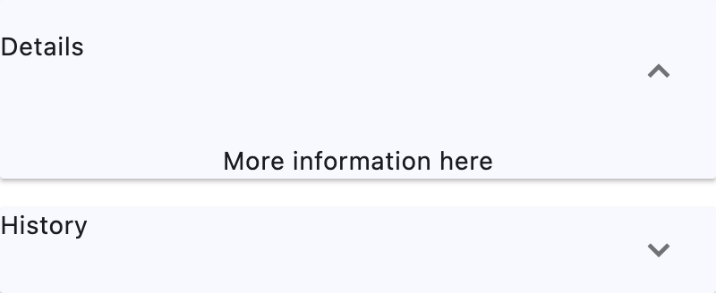
Basic ExpansionPanelList
Inherits: LayoutControl
Properties
-
controls(list[ExpansionPanel]) –A list of panels to display.
-
divider_color(ColorValue | None) –The color of the divider when
-
elevation(Number) –Defines the elevation of the
controls, when expanded. -
expand_icon_color(ColorValue | None) –The color of the icon.
-
expanded_header_padding(PaddingValue) –Defines the padding around the header when expanded.
-
spacing(Number | None) –The size of the gap between the
controlss when expanded.
Events
-
on_change(ControlEventHandler[ExpansionPanelList] | None) –Called when an item of
controlsis expanded or collapsed.
Examples#
Basic Example#
import flet as ft
def main(page: ft.Page):
page.theme_mode = ft.ThemeMode.LIGHT
def handle_change(e: ft.Event[ft.ExpansionPanelList]):
print(f"change on panel with index {e.data}")
def handle_delete(e: ft.Event[ft.IconButton]):
icon_button = e.control
tile = icon_button.parent
panel = tile.parent
panel_list.controls.remove(panel)
page.update()
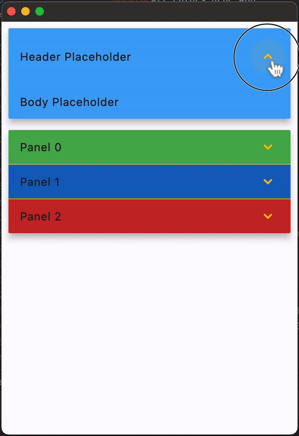
panel_list = ft.ExpansionPanelList(
expand_icon_color=ft.Colors.AMBER,
elevation=8,
divider_color=ft.Colors.AMBER,
on_change=handle_change,
controls=[
ft.ExpansionPanel(
# has no header and content - placeholders will be used
bgcolor=ft.Colors.BLUE_400,
expanded=True,
),
],
)
colors = [
ft.Colors.GREEN_500,
ft.Colors.BLUE_800,
ft.Colors.RED_800,
]
for i in range(len(colors)):
bgcolor = colors[i % len(colors)]
panel_list.controls.append(
ft.ExpansionPanel(
bgcolor=bgcolor,
header=ft.ListTile(title=ft.Text(f"Panel {i}"), bgcolor=bgcolor),
content=ft.ListTile(
bgcolor=bgcolor,
title=ft.Text(f"This is in Panel {i}"),
subtitle=ft.Text(f"Press the icon to delete panel {i}"),
trailing=ft.IconButton(
icon=ft.Icons.DELETE,
on_click=handle_delete,
),
),
)
)
page.add(panel_list)
ft.run(main)
Properties#
class-attribute
instance-attribute
#
controls: list[ExpansionPanel] = field(default_factory=list)
A list of panels to display.
class-attribute
instance-attribute
#
divider_color: ColorValue | None = None
The color of the divider when
ExpansionPanel.expanded is False.
class-attribute
instance-attribute
#
expand_icon_color: ColorValue | None = None
The color of the icon.
Defaults to Colors.BLACK_54 in light theme mode and
Colors.WHITE_60 in dark theme mode.
class-attribute
instance-attribute
#
expanded_header_padding: PaddingValue = field(
    default_factory=lambda: symmetric(vertical=16.0)
)
Defines the padding around the header when expanded.
class-attribute
instance-attribute
#
spacing: Number | None = None
The size of the gap between the controlss when expanded.
Events#
class-attribute
instance-attribute
#
on_change: (
    ControlEventHandler[ExpansionPanelList] | None
) = None